PAMPANGA—The Amateur Media Association of Philippine Scouts unveils their new logo, late at night on Wednesday, February 10.
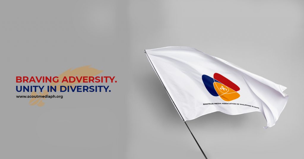
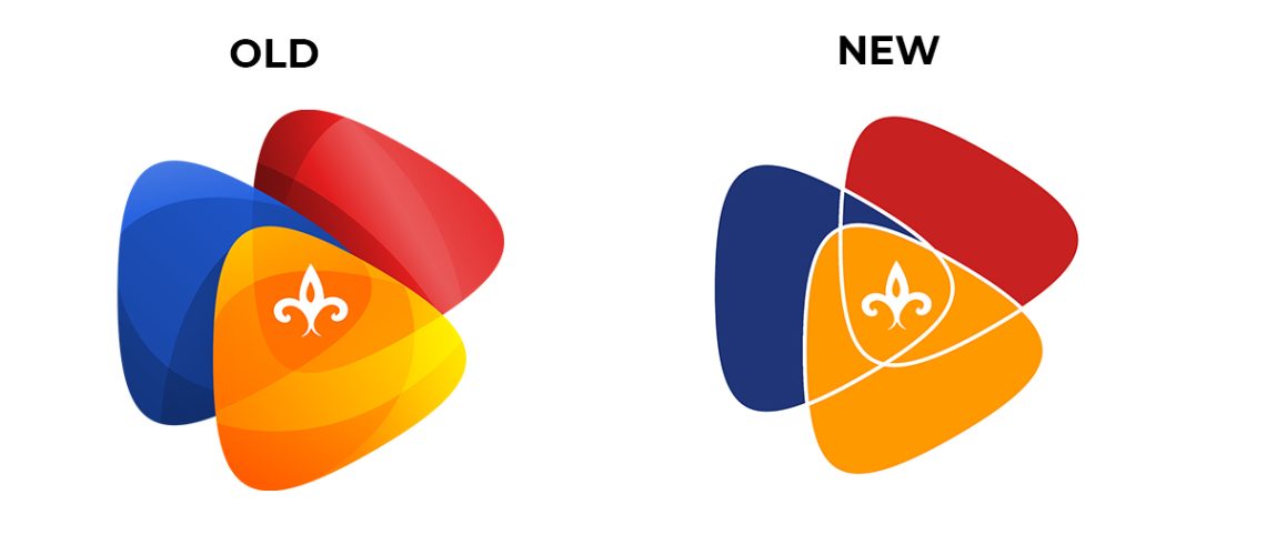
From a gradient-filled logo, the Scout media group changed its logo to a simple flat version. According to AMAPS Director for Scouting Affairs Jan Khim Gamora, the rebranding was supposed to happen months ago.
“The original logo symbolizes for Senior and Rover Scouts of the Boy Scouts of the Philippines, while the orange symbolizes for Cadet Girl Scouts of the Girl Scouts of the Philippines,” Gamora said.
When AMAPS decided to halt its recruitment to GSP, the color orange became meaningless. It has been raised on several occasions to remove the color. However, some members of the Executive Committee stand that this has become part of the AMAPS identity.
In January, they conducted the first Scout Journalism Skills Training and realized the need for a rebranding of their association. It also launched its initiative to establish community-based Scouting units in the same month.
READ: 1st Scout Journalism Skills Training concludes
The Facebook page of AMAPS Community Scouting used the new version of the logo with tweaks to hide it.
On February 8, the new logo was presented to the executive committee and got a go signal with unanimous votes.
AMAPS President Win Sharm Cinco mentioned that they made the steps to rebrand to conform with the growing program and membership of the group.
“As we grow, as we expand, we need an identity that can give us the distinction. This is also to make sure that our identity can adapt to our rapidly changing environment and trend,” Cinco said.
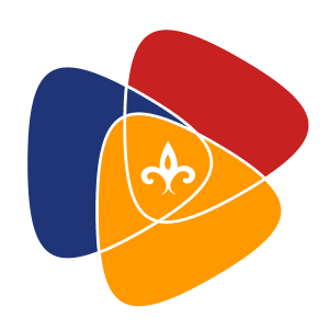
The logo can now be seen as a simple flat with three colors—red, blue, and orange—that symbolize courage, independence, and agility.
“We have been braving adversity for more than a year now; that is courage. We have been writing for the Scouts; that is independence. We have been adjusting to changing world; that is agility,” she added.
The change in their logo was also made for practicality. The production of AMAPS merchandise has been costly due to its 3d nature. Now that it will only use three colors of threads, it will be easier and cheaper.
The new logo can be seen on their social media accounts and their website.
